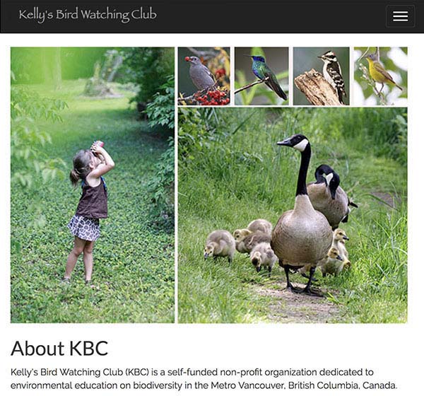
Birding - Responsive project
Design Tool:
HTML / CSS / JavascriptProject Purpose:
Using the Bootstrap responsive framework with coding editor to code a responsive site layout that resizes for mobile and for desktop.
Project Brief:
- Build a responsive site – sized using media queries for mobile and desktop.
- Utilize Bootstrap as a starting point
- Use CSS to style headers / navigation / text and media content and layout structure.
- Create media queries to separate the mobile from the desktop design.
- Design the logo, navigation, other button links or text links, shopping cart, secondary navigation, image areas, visible headers/sub-headers, text content area, maps and other specific site features (forms elements, interactive elements, etc)
- When the design minimizes, the menu condense into a hamburger menu icon.